Whoever has done research and has tried to present this research, knows how difficult it can be to display said results in a proper manner and how frustrating it is if your visualizations do not get the (right) message across. I therefore have a high appreciation for researchers who, besides getting to the point, have the ability to create great looking (interactive) data visualizations. If you agree with me, you might want to take a look at the two lists below. The second list is solely dedicated to (interactive) maps, since they fascinate me even more.
- http://histography.io/
- https://jordibruin.github.io/food-scanner/
from: https://www.notion.so/Hello-a85a8e30d9f443ae85ce25c57b3c1fca - http://wonder-wall.com/
- http://tha.jp/
Japanese Interactive Designer (yugop.net) - http://dadaviz.com/s/browser-popularity-country#4641
Dadaviz has some nice visualizations (gifs and illustrations) of statistical data - http://animagraffs.com/
Animations/ gifs explaining how things work - http://sirvizalot.blogspot.nl/2016/03/color-popularity-for-new-cars-2000-2015.html
Interpreting data and making graphs (including the how-tos) - https://www.sizzleanalytics.com/Boards/sizzle/Spotify-Top-Tracks-20152016/bd60eb00-25f1-4d02-ac26-3e3d34b1b90e
Statistical overview of Top Tracks played on Spotify
MAPS
- https://www.vox.com/a/internet-maps?utm_medium=social&utm_source=facebook&utm_campaign=voxdotcom&utm_content=saturday
How does did the internet come into existence - http://www.digitalattackmap.com/#anim=1&color=0&country=ALL&list=0&time=17390&view=map
Map of DDOS attacks - http://code.waag.org/buildings/#52.0617,5.1471,12
Map of buildings in NL shaded by construction year (back until 1800) - http://everynoise.com/engenremap.html
A different kind of map. A map showing all genres in music - http://hooikoorts.plekjes.com/
A map of all hay fever trees around The Hague - http://stars.chromeexperiments.com/
A map of the Milkyway and our position in it - http://htwins.net/scale2/
The map with the scale of everything - http://iss.astroviewer.net/
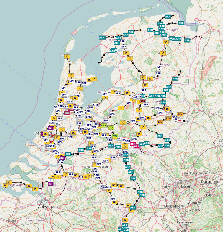
Tracking the ISS - http://spoorkaart.mwnn.nl/
Live information about the trains on the Dutch rail roads - http://earth.nullschool.net/#current/wind/isobaric/1000hPa/
This map shows the current windflows and their speed all around the world
- http://www.sciencemag.org/news/2015/02/new-map-shows-americas-quietest-places
This map shows decibells of loudness in american cities